Showing posts with label 2 3/8" Circle Punch. Show all posts

Wednesday, July 10, 2024

ICS July Blog Hop Let's Get Punchy

 
Welcome to the ICS July Blog Hop as we showcase punches with our theme "Let's Get Punchy". Our wonderful Design Team will be sharing their ideas and projects to help you get creative with your punches. There are so many options to explore to help you create your own beautiful creations. 
For my card, I chose to create a pretty Christmas card design for Christmas in July, focusing on the 2" & 2 3/8" Circle Punches to show how versatile they are for creating sentiments. In addition, I chose to use the Bough Punch to add some foliage to the sentiment to step it up. I paired these punches with the new Online Exclusive products, Greetings of the Season stamp set and coordinating Season of Green & Gold Specialty Designer Series Paper to create a stepped up clean and simple design. I love how the Gold accents and Gold embossing take this design to the next level.
Products Used:
Greetings of the Season stamp set (item #164325)
2" Circle Punch (item #133782)
2 3/8" Circle Punch (item #16354)
Bough Punch (item #157711)
Season of Green & Gold Specialty Designer Series Paper 
(item #164324)
Mossy Meadow Cardstock (item #133676)
Garden Green Cardstock (item #102584)
Old Olive Cardstock (item #100702)
Gold Foil Sheets (item #132622)
Versamark Pad (item #102283)
Metallics Wow Embossing Powders (item #165678)
Pecan Pie 3/8" Center Stripe Ribbon (item #162744)
Stampin' Dimensionals (item #104430)
Mini Glue Dots (item #103683)
Measurements:
Mossy Meadow Cardstock
Card Base - 5 1/2" x 8 1/2" (Scored at 4 1/4")
Sentiment Circle punched out with the 2" Circle Punch
Garden Green Cardstock
2 Large Leaves punched out with the Bough Punch
Old Olive Cardstock
3 Small Sprigs punched out with the Bough Punch
Gold Foil Sheets
Medium Circle punched out with the 2 3/8" Circle Punch
Season of Green & Gold Specialty Designer Series Paper
Card Front - 5 1/4" x 4"
I love making Christmas cards in July because there is no pressure or stress like there is around the holidays. With the new products just added to the Online Exclusives this month, it was a perfect opportunity to showcase a couple of them while showing how punches can help to create fun clean and simple card designs. The card front was created using one of the designs from the Season of Green & Gold Specialty Designer Series Paper and I just love how there are hints of Gold that give the card an elegant feel. I used the 2" Circle Punch for the sentiment and heat embossed the image from the new Greetings of the Season stamp set with Gold embossing powder onto the Mossy Meadow cardstock to make it pop. I layered it onto a larger circle of Gold Foil punched out using the 2 3/8" Circle Punch and I love how this creates a beautiful frame for the sentiment. I added two pieces of the Pecan Pie Center Striped Ribbon to the center of the card front using Mini Glue Dots and added the focal circles to the card front using Stampin' Dimensionals. I arranged the Old Olive and Garden Green foliage pieces that I punched out using the Bough Punch, tucking them underneath the circles to hide the stem. I love how this beautiful Christmas card turned out and I can't wait to try some of the other designs and sentiments to create a stack ready for the holidays. 
Thank you for taking the time to visit my blog. I hope that my card design will help inspire you to explore using punches to create your own wonderful projects. One of my favorite things about punches is how quick and easy it is to create projects using them. As you can see from my card design, it is a great way to mix and match to create your own beautiful designs. 
Now it's time to visit Janey's blog and see what she has to share with us. Just click on the Next button to visit her blog. We would appreciate it if you would leave us a comment and let us know what you like about our projects. I hope you enjoy the rest of our blog hop. 


If you live in the U.S. and do not have a Stampin' Up! Demonstrator, please contact me and I would be happy to help you with your creative projects. You may also visit my Online Store to place your order and have it shipped to you. 

Until Next Time

Happy Stamping,

Tricia Butts
Independent Stampin' Up! Demonstrator

Like What You See? Visit My Online Store Here

Visit My Facebook Business Page for Updates & Ideas

Click here to Contact Me


Friday, January 19, 2024

Crafty Collaborations Monochromatic Color Challenge - Boho Blue

Welcome back to the Crafty Collaborations Monochromatic Color Challenge, with Week 3's color, Boho Blue. I love how soft and pretty this beautiful blue is to create with and today I chose to create a Sympathy card design using one of the designs from the Flight & Airy Designer Series Paper, one of the Level 1 Rewards you can earn free with a qualifying $50 order during Sale-a-bration.
Sympathy cards are probably the hardest card design for me to create. They are so personal and I try to design a card that will provide comfort during a difficult time. For today's card design, I used the monochromatic Boho Blue design from the Flight & Airy Designer Series Paper for the card background because it reminded me of the sky. I love the texture the watercolor background adds to the design, kind of like a moody sky before a storm. The butterfly die cut I chose to use for the focal image is from the new Paper Butterfly Accents in the January-April 2024 Mini Catalog. I created a watercolor wash look using a drop of Boho Blue ink mixed with Clear Wink of Stella to paint the butterfly and to give it that pretty shimmer and soft color. I love how this design turned out and I hope it provides comfort to the person receiving it.
Products Used:
Heartfelt Hexagon Bundle (item #162889)
Cloud Punch (item #157749)
2 3/8" Circle Punch (item #161354)
Painted Texture 3D Embossing Folder (item #154317)
Paper Butterfly Accents (item #162612)
Flight & Airy Designer Series Paper (item #162977) Level 1 
Sale-a-bration Reward
Boho Blue Cardstock (item #161724)
Basic White Cardstock (item #159276)
Boho Blue Classic Ink Pad (item #161650)
Boho Blue Classic Ink Refill (item #161656)
Clear Wink of Stella Glitter Brush (item #141897)
Boho Blue 3/8" Textured Ribbon (item #161631)
Blending Brushes (item #153611)
Stampin' Dimensionals (item #104430)
2023-2025 In Color Dots (item #161620)
Measurements:
Boho Blue Cardstock
Card Base - 8 1/2" x 5 1/2" (Scored at 4 1/4")
Mat Sentiment Layer punched out with the Heartfelt Hexagon Punch
Medium Circle punched out with the 2 3/8" Circle Punch and embossed with the Painted Texture 3D Embossing Folder
Basic White Cardstock
2 Clouds punched out with the Cloud Punch
Sentiment Label punched out with the Heartfelt Hexagon Punch
Flight & Airy Designer Series Paper
Card Front - 5 1/4" x 4"
Paper Butterfly Accents
1 Medium Butterfly Die Cut colored with Boho Blue ink & Clear Wink of Stella 
My vision for this card design was a pretty pale blue butterfly floating amongst the clouds. The designer series paper created the perfect background for the card design and I added a Boho Blue cardstock circle that I embossed with the Painted Texture 3D Embossing Folder to create the textured background for the focal image. I punched out two clouds from Basic White cardstock and gently added some Boho Blue Classic ink around the outside edges using a Blending Brush to add definition. I attached the top cloud to the embossed circle with adhesive and then added the second cloud with Stampin' Dimensionals so that it slightly overlaps the bottom cloud. I attached the water colored butterfly to the top cloud, centering it at a slight angle. To add some subtle bling, I added three Boho Blue Dots to the center of the butterfly.
For the sentiment label, I stamped the sentiment image from the Heartfelt Hexagon stamp set with Boho Blue Classic ink onto Basic White cardstock and punched it out with the coordinating Heartfelt Hexagon Punch. I also punched out a label from Boho Blue cardstock and cut it in half and attached it behind the sentiment label to create a narrow frame. I added a piece of the Boho Blue Texured Ribbon to the card front, towards the bottom right corner and added the sentiment label over the top with Stampin' Dimensionals. I added the focal image about the sentiment and slightly to the left, adhering it to the card front to complete the card design. I love how this card design showcases the variations you can get with this beautiful color using a variety of coordinating products. So what do you think? Are you ready to give Boho Blue a try? 
Thank you for taking the time to visit my blog. I hope that my card design will help inspire you to try using Boho Blue to create your own beautiful projects. This pretty blue has so many wonderful coordinating products to help spark your creativity. Click here to visit my Online Store to see all the wonderful Boho Blue products available. 
Please take the time to visit this week's Crafty Collaborations Monochromatic Color Insta Hop on Instagram and see all the other amazing projects created by my fellow demonstrators. Just click here to get started. 

If you live in the U.S. and do not have a Stampin' Up! Demonstrator, please contact me and I would be happy to help you with your creative projects. You may also visit my Online Store to place your order and have it shipped to you. 

Until Next Time

Happy Stamping,

Tricia Butts
Independent Stampin' Up! Demonstrator

Like What You See? Visit My Online Store Here

Visit My Facebook Business Page for Updates & Ideas

Click here to Contact Me


Get Creative For 2024
With The January-April 2024 Mini Catalog
Click Below To Shop Now

Let's Sale-a-Brate!
Earn Exclusive Free Products With A Qualifying Order
Click Below For More Details


Friday, January 12, 2024

Crafty Collaborations Monochromatic Color Challenge - Wild Wheat

It's time for Week 2 of the Crafty Collaborations Monochromatic Challenge and this week our color is Wild Wheat, one of our 2023-2025 In Colors. We have been challenged to create a card design using this color to showcase Stampin' Up!'s amazing color coordination to help spark your own creativity. 
Wild Wheat is one of those colors that people can have strong feelings about. At first glance, it may not be a color that you would be drawn to, but I am hoping that my card design will encourage you to give this chameleon like color a second look. I have chosen to use one of the designs from the Softly Stippled Designer Series Paper, a Sale-a-bration Level 1 Reward you can earn Free with a qualifying $50 order. I love this beautiful tone on tone botanical design and it has this wonderful vintage feel to it. I wanted to create a clean and simple design that would allow this color to shine, so I chose to use the Layering Leaves stamp set from the 2023-2024 Annual Catalog, with its wonderful sentiments that work well for a variety of occasions. With some detailed die cuts using the coordinating Stippled Roses Dies to add some texture and a little coordinating bling, I think this card design showcases this beautiful color.
Products Used:
Layering Leaves stamp set (item #161277)
2 3/8" Circle Punch (item #161354)
Stippled Roses Dies (item #162666)
Softly Stippled Designer Series Paper (item #162975) Sale-a-bration Level 1 Reward
Wild Wheat Cardstock(item #161725)
Basic White Cardstock (item #159276)
Wild Wheat Classic Ink Pad (item #161651)
2023-2025 In Color Dots (item #161620)
Stampin' Dimensionals (item #161620)
Measurements:
Wild Wheat Cardstock
Card Base - 5 1/2" x 8 1/2" (Scored at 4 1/4")
Detailed Leaves die cut with the Stippled Roses Dies
Basic White Cardstock
1 Large Circle punched out with the 2 3/8" Circle Punch
Softly Stippled Designer Series Paper
Card Front - 5 1/4" x 4"
This is such a simple card design but I feel like the simplicity helps to showcase what a beautiful color Wild Wheat really is. I love how it looks with botanical prints like the one I have chosen for the card front for this design. I feel like this color has a slight olive tinge to it that lends itself well with leaves and foliage, so I added the detailed die cuts created with the Stippled Roses Dies to add some contrast and texture to the design. For the sentiment, I stamped the image from the Layering Leaves stamp set with Wild Wheat Classic ink onto Basic White cardstock and punched it out with the 2 3/8" Circle Punch. I added the circle to the card front to pop it up using Stampin' Dimensionals, layering it over the detailed die cuts. For a touch of bling, I added several of the Wild Wheat Dots to finish off the design. To me, this card design has the look of aged Gold that you would find on a vintage card. So what do you think? Are you a fan of Wild Wheat? Let me know what you think.
Thank you for taking the time to visit my blog. I hope that my card design will encourage you to give Wild Wheat a second look and hopefully you will see the amazing possibilities with this color. With all the coordinating products available, you can have so much fun mixing and matching to create your own beautiful design.

I would love it if you would take the time hop along our Insta Hop here to visit with my fellow Stampin' Up! Demonstrators and see what they created with this week's color, Wild Wheat. We would appreciate it if you would leave us a comment to let us know what you liked about our projects.  I hope you will join me next week for a new color challenge to help inspire you.
Don't forget to take advantage of the wonderful Sale-a-bration products that are available to earn free with a qualifying order until February 29th. In addition to the beautiful Softly Stippled Designer Series Paper, there are a variety of stamp sets, designer series papers, Dies and even an Embossing Folder to choose from. Visit my Online Store here to learn more. 

If you live in the U.S. and do not have a Stampin' Up! Demonstrator, please contact me and I would be happy to help you with your creative projects. You may also visit my Online Store to place your order and have it shipped to you. 

Until Next Time

Happy Stamping,

Tricia Butts
Independent Stampin' Up! Demonstrator

Like What You See? Visit My Online Store Here

Visit My Facebook Business Page for Updates & Ideas

Click here to Contact Me


Get Creative In 2024
With The January-April 2024 Mini Catalog
Click Below To Shop Now

Sale-a-Bration Is Here!
Earn Exclusive Free Products With A Qualifying Order
Click Below For More Details


Friday, December 1, 2023

We Create December Blog Hop Merry Wishes

Let's start the month of December off with some Merry Wishes. This month the We Create Blog Hop will be sharing projects with the theme "Merry Wishes" to help you with your last minute holiday projects. I hope that you will inspired to get creative for the holiday season.
Today's Christmas card is another version of the Book Binding Fold I shared here last weekend. This time I chose more traditional Christmas colors, including the Joy of Christmas Designer Series Paper. I love the watercolor look of this beautiful paper and I chose to use Shaded Spruce for the card base and sentiment circle with a touch of Gold embossing. The ribbon is the Real Red & Gold Dotted Ribbon that is available from the Online Exclusives while supplies last. I thought it added a wonderful festive touch.
Products Used:
Very Best Occasions stamp set (item #159871)
Joy of Noel stamp set (item #161959)
 2 3/8" Circle Punch (item #161354)
Joy of Christmas Designer Series Paper (item #161958)
Shaded Spruce Cardstock (item #146981)
Basic White Cardstock (item #159276)
Versamark Pad (item #102283)
Metallic Embossing Powders (item #155555)
Festive Pearls (item #159963)
Real Red & Gold 3/8" Dotted Ribbon (item #162353)
Tear & Tape Adhesive (item #154031)
Stampin' Dimensionals (item #104430)
Measurements:
Shaded Spruce Cardstock 
Card Base - 4 1/4" x 11" (Scored at 5 1/2" & 6 3/4")
Sentiment Circle punched out with the 2 3/8" Circle Punch
Joy of Christmas Designer Series Paper
Front Panel - 4"x4"
Side Strip - 1" x 4"
Basic White Cardstock
Inside Layer - 4"x4"
I love how using different paper designs can transform a card into something completely differently. For this card design, I used the red and green print for the card front and the reverse wood grain side for the side panel. I love the botanical feel of these designs and how they looked with Shaded Spruce. To step up the design, I heat embossed the sentiment with Gold embossing to add a touch of elegance and the Real Red & Gold Dotted Ribbon adds a wonderful pop of color and texture to the design. For a touch of bling, I used the Red Festive Pearls to create the holly berries on the sentiment. 
Thank you for taking the time to visit my blog. I hope that my card design will help inspire you to create your own beautiful Christmas cards to send to family and friends to celebrate the season. There are so many wonderful possibilities to explore.
Now it's time to visit Libby's blog and see what she has to share with us. Just click on the Next button below to see her wonderful ideas. We would love it if you would leave us a comment and let us know what you liked about our projects. I hope you enjoy the rest of our blog hop.

Roll Call List

If you live in the U.S. and do not have a Stampin' Up! Demonstrator, please contact me and I would be happy to help you with your creative projects. You may also visit my Online Store to place your order and have it shipped to you. 

Until Next Time

Happy Stamping,

Tricia Butts
Independent Stampin' Up! Demonstrator

Like What You See? Visit My Online Store Here

Visit My Facebook Business Page for Updates & Ideas

Click here to Contact Me


Wednesday, September 27, 2023

Paper Pumpkin Possibilities September Blog Hop Love & Gratitude

Welcome to the Paper Pumpkin Possibilities September Blog Hop and this month we are sharing alternative project ideas using the Love & Gratitude Kit. This beautiful kit has a lovely Fall feel to it, which is perfect for this time of year. Our Design Team will be sharing their projects and ideas to help you get into the spirit of the season. 
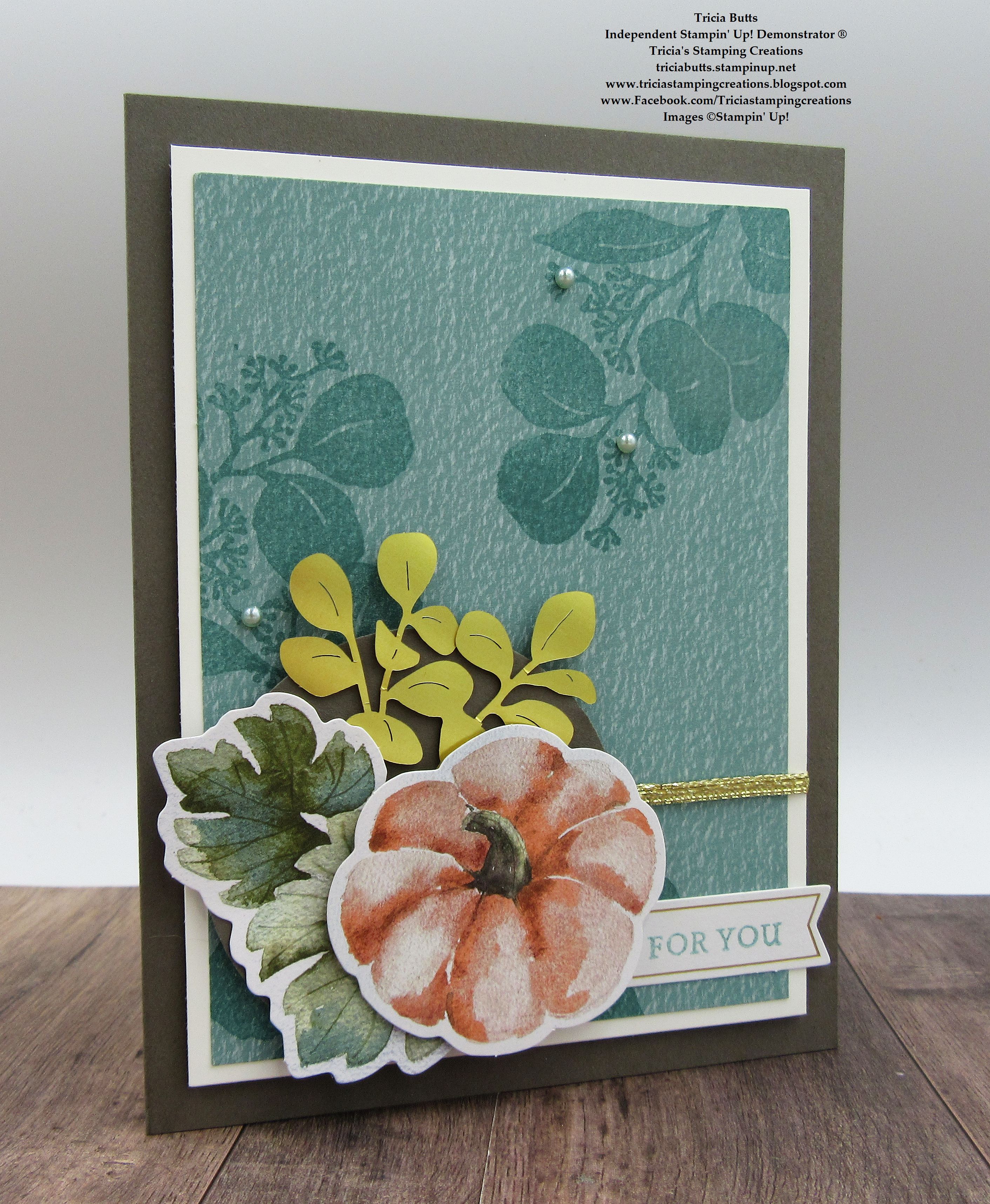
One of my favorite things about this kit are the wonderful die cuts used to decorate the cards and bags. They have an almost vintage feel to them and I knew that I wanted to use them for my focal image. Instead of creating the small card in the kit, I decided to show how to transform the pieces from that card into a full size card that you could mail to a friend. To achieve this, I added a Pebbled Path cardstock card base and a Basic White cardstock layer to help frame the focal design. I love how these beautiful colors work together to create this versatile card design that could be used for a variety of occasions.
Products Used:
September Paper Pumpkin Love & Gratitude Kit
2 3/8" Circle Punch (item #161354)
Pebbled Path Cardstock (item #161722)
Basic White Cardstock (item #159276)
Gold & Silver 1/8" Trim Combo Pack (item #161633)
Festive Pearls (item #159963)
Measurements:
Pebbled Path Cardstock
Card Base - 8 1/2" x 5 1/2" (Scored at 4 1/4")
Basic White Cardstock 
Layer 1 - 5" x 3 3/4"
Love & Gratitude Kit
Lost Lagoon Texture Card Front - 3 1/2" x 4 3/4"
This card design is very much a CASE of the design on the small card from the kit. I cut the small Lost Lagoon card base to create the card front and then stamped the tone on tone background design using the large leaf stamp from the exclusive stamp set with the Lost Lagoon Stampin' Spot onto the card front. I love how the combination of the textured background and the stamped leaves creates a pretty background that helps anchor the focal design. I layered the Lost Lagoon card front onto the Basic White cardstock layer and then added a piece of  Gold 1/8" Trim around the card front to cover the fold score line. You could add a bow if you wanted to, but I wanted to keep the design relatively clean. I then added this layer to the Pebbled Path card base with Stampin' Dimensionals from the kit. To decorate the card front, I added a Pebbled Path circle that I punched out with the 2 3/8" Circle Punch, to the bottom left corner of the Lost Lagoon card front. I layered the die cuts from the kit to create the focal image, adding the pumpkin with Stampin' Dimensionals. For the sentiment, I stamped the For You image with the Lost Lagoon Stampin' Spot to the sentiment label from the kit and attached it to the card front, making sure to tuck the left end underneath the pumpkin die cut. To complete the card design, I added several of the light green pearls from the Festive Pearls for a touch of bling. I love that these pearls are close enough in color to coordinate with the Lost Lagoon elements for this card. 
Thank you for taking the time to visit my blog. I hope that my card design will help inspire you to think outside the box to create your own wonderful projects with this kit. There are so many wonderful ways to create alternative card designs with the supplies in this kit.
Please take a moment to visit with my fellow Design Team members by clicking on the links in the Roll Call List below. There are so many amazing projects to help spark your creativity. We would love it if you would leave us a comment and let us know how our projects inspired you. 

If you live in the U.S. and do not have a Stampin' Up! Demonstrator, please contact me and I would be happy to help you with your creative projects. You may also visit my Online Store to place your order and have it shipped to you. Not a Paper Pumpkin subscriber yet? Now is the perfect time to sign up to receive the October Kit, Home for the Holidays card kit. Sign up by October 10th to receive this kit by clicking the link below. As a subscriber, you can also order past kits and refills that are available in my Online store. 

Until Next Time

Happy Stamping,

Tricia Butts
Independent Stampin' Up! Demonstrator

Like What You See? Visit My Online Store Here

Visit My Facebook Business Page for Updates & Ideas

Click here to Contact Me


Create Sparkling Christmas Cards
With The Home For The Holidays Kit
Click Below To Subscribe by October 10th

Get Creative For The Holidays
With The September-December 2023 Mini Catalog
Click Below To Visit My Online Store