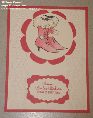
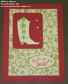
One of the things I love about attending Stampin' Up! events, are all the wonderful card designs and ideas that inspire me with my creations. At the Denver Regional, I had the opportunity to take photos of hundreds of different cards and projects on display that were generously shared by demonstrators.
Today I thought I would share a few photos of cards created that have that Wow! factor without being overly complicated. Some feature punches, perhaps some Designer Series Paper or maybe some ribbon to make the design pop.
These first two cards are examples of how different techniques can provide a different look to your card design. The top card focuses on stamping, with the ornaments arranged with the smaller ornament stamped separately and die cut before adding to the card. There is a classic elegance to this card design which is in contrast to the card below it.
Both cards have that eye-catching quality without being overly fussy or difficult to create. The next two cards show how you can take die cutting and give it a little twist for an unexpected look.
The Season's Greetings card features Designer Series paper as the focus of the card. The opening was cut with the large framelit from the Apothecary Accents set. By filling the negative space with strips of Designer Series paper from the Be of Good Cheer DSP pack, you take a simple white card base and make it a Wow card. The Cherry Cobbler 1/2" Scallop Dots Ribbon adds the perfect embellishment to the sentiment for a quilted look to a traditional Christmas card.
This next card was created using the Holiday Collections Framelits set, which can be purchase separately or as part of the Scentsational Season Bundle in the 2012 Holiday Catalog. Once again the negative space created by the framelits has been filled, this time with various ribbon scraps to add color and dimension to this card design. The little tags and Early Espresso Bakers Twine give the card a rustic, country feel.
Until Next Time.
Happy Stamping,
Tricia Butts
http://www.triciabutts.stampinup.net


