Wednesday, June 12, 2024

ICS June Blog Hop It's A Guy Thing

Welcome to the ICS June Blog Hop and this month our theme is "It's a Guy Thing". Masculine cards can be challenging at the best of times, so our wonderful Design Team will be sharing their projects and ideas to help spark your creativity and help you create something special for the guys in your life. 
For my masculine card, I decided to go with a silhouette scenic design using minimal supplies and no stamping. Yes, you read that correctly, I said no stamping. When I combined the beautiful designer series background with the detailed silhouette card front, I felt like it was perfect without a sentiment. Sometimes, less is more and I think that is true for this card design. 
Products Used:
Groves Dies (item #157844)
Thoughtful Journey 6"x6" Designer Series Paper (item #163303)
Basic Black Cardstock (item #121045)
Stampin' Dimensionals (item #104430)
Measurements:
Basic Black Cardstock
Card Base - 5 1/2" x 8 1/2" (Scored at 4 1/4")
Detailed Card Front - 3 3/4" x 5" die cut with the Groves Dies
2 Deer die cut with the Groves Dies
Thoughtful Journey Designer Series Paper
Background Layer - 5 1/4" x 4"
This beautiful design is a great example of how you can create wonderful cards without a lot of supplies and without a lot of fuss. The delicate die cut card front was created using the Groves Dies to create a silhouette from Basic Black cardstock and when it is placed on top of the layer of designer series paper, it creates the look of a sunset in the woods with the colors of the background making the silhouette come alive.  I used Stampin' Dimensionals to pop up the detailed card front and then added the two deer to the background so that the bottom of their legs are hidden behind the grass at the bottom. It's a great way to add some subtle dimension to the design and the outer edge of the designer series paper creates a beautiful frame around the scene. The Basic Black card base helps to tie everything together to create a wonderful clean and simple card design that is suitable for a variety of occasions. 
Thank you for taking the time to visit my blog. I hope that my card design will help inspire you to create your own beautiful cards for the men in your lives. Masculine cards don't have to be fancy or intimidating. Just keep it clean and simple using Stampin' Up!'s wonderful coordinating products to help take the stress out of creating. 
Now it's time to visit  Joni blog and see what she has created for this month's challenge. Just click on the Next button below to visit her blog. We would love it if you would leave us a comment and let us know what you like about our projects. I hope you enjoy the rest of our blog hop. 

If you live in the U.S. and do not have a Stampin' Up! Demonstrator, please contact me and I would be happy to help you with your creative projects. You may also visit my Online Store to place your order and have it shipped to you. 

Until Next Time

Happy Stamping,

Tricia Butts
Independent Stampin' Up! Demonstrator

Like What You See? Visit My Online Store Here

Visit My Facebook Business Page for Updates & Ideas

Click here to Contact Me


Save An Extra 10% On Select Bundles
Plus 10% Off Stampin' Cut & Emboss Machines
Click Below To Visit My Online Store 


Saturday, June 8, 2024

Stamping Inkspirations June Blog Hop Tic-Tac-Toe Challenge

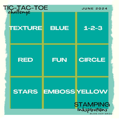
It's time to hop along with the Stamping Inkspirations June Blog Hop and this month we have a Tic-Tac-Toe Challenge to help spark our creativity. Our Design Team will be sharing their wonderful projects and ideas to help inspire you. How does the challenge work? Well, just like in the game, you pick three boxes in a row either horizontally, vertically or diagonally, to use to create your project. There are so many different options, which means you will see a wonderful variety of projects. 
For my card, I chose to use the bottom horizontal row with stars, emboss and yellow as the elements for my design. I don't use Lemon Lolly very often, so I chose to use that as my yellow because it coordinates with one of the stars patterns in the Bright & Beautiful 6"x6" Designer Series Paper. This pretty yellow is perfect for a baby card design and I chose the Warm Welcome stamp set to create the sentiment, which I heat embossed with Gold embossing powder. I also added a little texture with the new Eyelet 3D Embossing Folder to help step up the design. I thought this design would be perfect as a non-gender specific baby card while still keeping it clean and simple. 
Products Used:
Warm Welcome stamp set (item #160698)
Eyelet 3D Embossing Folder (item #163414)
2 3/8" Circle Punch (item #161354)
Bright & Beautiful 6"x6" Designer Series Paper (item #161449)
Versamark Pad (item #102283)
Metallics Wow Embossing Powders (item #165678)
Rainbow Adhesive Backed Dots (item #162758)
Measurements:
Lemon Lolly Cardstock
Card Base - 5 1/2" x 8 1/2" (Scored at 4 1/4")
Center Strip - 2" x 4" Embossed with the Eyelet 3D Embossing Folder
Basic White Cardstock
Medium Circle punched out with the 2 3/8" Circle Punch
Bright & Beautiful Designer Series Paper
Card Front - 5 1/4" x 4"
For this card design, I chose a monochromatic color palette using just Lemon Lolly and Basic White with a little Gold embossing for a touch of elegance. I didn't want a design that was too frilly or fancy in keeping with the neutral color palette. The stars in the designer series paper were perfect for the background and I added a middle strip that I embossed with the new Eyelet 3D Embossing Folder that gives the card texture and an almost quilted look to the design. For the focal circle, I punched out a circle using the 2 3/8" Circle Punch and heat embossed the sentiments and shoes image with Gold embossing powder to help step up the design. I love that the cute little shoes signify the new addition to the family without being specific to a baby boy or baby girl. I added the focal circle to the center of the embossed strip with Stampin' Dimensionals to help pop it up. To complete the design, I added several of the Lemon Lolly Dots from the Rainbow Adhesive Backed Dots for a tone on tone look. Do you think I met the Tic-Tac-Toe Challenge requirements? Let me know what you like best about this card design. I would love to hear your thoughts.
Thank you for taking the time to visit my blog. I hope that my card design will help spark your creativity and encourage you to create your own beautiful projects using this fun challenge. There are so many great options to explore. 
Now it's time to visit Judith's blog and see what she has created with this Tic-Tac-Toe Challenge. Just click the Next button below to visit her blog or use the Roll Call List below. We would love it if you would leave us a comment and let us know what you liked about our projects. 

Roll Call List

If you live in the U.S. and do not have a Stampin' Up! Demonstrator, please contact me and I would be happy to help you with your creative projects. You may also visit my Online Store to place your order and have it shipped to you. 

Until Next Time

Happy Stamping,

Tricia Butts
Independent Stampin' Up! Demonstrator

Like What You See? Visit My Online Store Here

Visit My Facebook Business Page for Updates & Ideas

Click here to Contact Me


Save An Extra 10% On Select Bundles
Plus 10% Off Stampin' Cut & Emboss Machines
Click Below To Shop Now

Explore Your Creativity
With The New 2024-2025 Annual Catalog
Click Below To Visit My Online Store


Friday, June 7, 2024

Global Stamping Friends June Blog Hop Coloring Inside The Lines

 
Welcome to the Global Stamping Friends June Blog Hop and this month our theme is "Coloring Inside the Lines". Our Design Team will be sharing their projects and ideas to help inspire you to explore all the wonderful coloring options Stampin' Up! has to offer. 
One of my favorite coloring techniques would have to be coloring with Stampin' Blends Markers. I love the way these alcohol markers blend and the beautiful vibrant colors. For this card design, I chose to use the new Spotlight on Nature Bundle, which is one of the bundles on sale this month with an additional 10% discount. I paired it with one of the designs from the Thoughtful Journey 6"x6" Designer Series Paper. I just love the soft, water color background it creates for the card design that combines beautifully with the focal images. 
Products Used:
Spotlight On Nature Bundle (item #163581)
Stylish Shapes Dies (item #159183)
Thoughtful Journey 6"x6" Designer Series Paper (item #163303)
Misty Moonlight Cardstock (item #153081)
Basic White Cardstock (item #159276)
Memento Tuxedo Black Pad (item #132708)
Versamark Pad (item #102283)
Basics Wow Embossing Powders (item #165679)
Boho Blue Stampin' Blends Combo Pack (item #161659)
Granny Apple Green Stampin' Blends Combo Pack (item #154885)
Petunia Pop Stampin' Blends Combo Pack (item #163828)
Pretty In Pink Stampin' Blends Combo Pack (item #163824)
Tinsel Gems Three Pack (item #161624)
Silver & White 1/2" Sheer Ribbon (item #162149)
Stampin' Dimensionals (item #104430)
Measurements:
Misty Moonlight Cardstock
Card Base - 5 1/2" x 8 1/2" (Scored at 4 1/4")
Sentiment Label die cut with the Stylish Labels Dies
Basic White Cardstock
Large Circle die cut with the Spotlight On Nature Dies 
Butterfly stamped and fussy cut
Thoughtful Journey Designer Series Paper
Card Front - 5 1/4" x 4"
This pretty card design is all about beautiful colors and I chose to use Boho Blue and Granny Apple Green Stampin' Blends Markers for the floral image and Pretty In Pink and Petunia Pop Stampin' Blends Markers for the butterfly image. To create the focal image, I used the Spotlight on Nature Dies to die cut the large detailed circle. I fussy cut the butterfly out after coloring it and added it to the circle with Stampin' Dimensionals to pop it up. For the sentiment label, I heat embossed the image with Basic White embossing powder and die cut the sentiment with the Stylish Shapes Dies. To add a touch of bling, I added several of the Misty Moonlight Gems and I piece of the Silver & White Sheer Ribbon behind the sentiment label. I love how the colors work together to create a beautiful thank you card. 
Thank you for taking the time to visit my blog. I hope that my card design will help inspire to create your own wonderful projects using coloring techniques. There are so many amazing options to explore. Don't forget to take advantage of the sale on select stamp & dies bundles this month and save an extra 10%. 
Now it's time to visit Kimberley's blog and see what she has created this month to share with us. Just click on the Next button below to visit her blog or use the Roll Call List to find your way. We would appreciate it if you would leave us a comment and let us know what you liked about our projects. 

Roll Call List

If you live in the U.S. and do not have a Stampin' Up! Demonstrator, please contact me and I would be happy to help you with your creative projects. You may also visit my Online Store to place your order and have it shipped to you. 

Until Next Time

Happy Stamping,

Tricia Butts
Independent Stampin' Up! Demonstrator

Like What You See? Visit My Online Store Here

Visit My Facebook Business Page for Updates & Ideas

Click here to Contact Me


Save An Extra 10% On Select Bundles
Plus 10% Off Stampin' Cut & Emboss Machines
Click Below To Shop Now


Crafty Collaborations Monochromatic Color Challenge Week 23 - Blackberry Bliss

 
Welcome to Week 23 of the Crafty Collaborations Monochromatic Color Challenge and this week we are showcasing Blackberry Bliss from the Neutrals Collections. This beautiful purple is so versatile and I can't wait to share what I created with it this week.
For my card design today, I chose to create a calm, peaceful design to provide comfort during a difficult time. I chose to use the Quiet Reflection stamp set to create the focal panel and added some texture using the Exposed Brick 3D Embossing Folder. To achieve the different shades of purple, I used a Blending Brush with the Blackberry Bliss Classic ink to create the background layer and I stamped the detailed image several times onto Basic White cardstock to create the focal image. I love how soothing this design is and how the different shades of Blackberry Bliss work to create this pretty card design.
Products Used:
Quiet Reflection stamp set (item #162689)
Everyday Details Dies (item #162864)
Deckled Rectangles Dies (item #159173)
Exposed Brick 3D Embossing Folder (item #161600)
Blackberry Bliss Cardstock (item #133675)
Basic White Cardstock (item #159276)
Blackberry Bliss Classic Ink Pad (item #147092)
Blackberry Bliss Stampin' Blends Combo Pack (item #154877)
Blending Brushes (item #153611)
Iridescent Pearls Basic Jewels (item #158987)
Measurements:
Blackberry Bliss Cardstock
Card Base - 5 1/2" x 8 1/2" (Scored at 4 1/4")
2 Panels die cut with the Deckled Rectangles Dies
Basic White Cardstock
Card Front - 5 1/4" x 4"
1 Panel die cut with the Deckled Rectangles Dies
Sentiment Circle die cut with the Everyday Details Dies
This beautiful card is all about layers of color that I was able to achieve using the Blackberry Bliss Classic ink. For the background layer, I applied a layer of color to the Basic White color using a Blending Brush to create a lighter, softer version of this pretty purple. For the texture. I embossed the two Blackberry Bliss panels that I die cut using the Deckled Rectangles Dies. For the focal design, I stamped the image three times, starting with the main image in the center and then stamping again on either side to create an extended version of the image. I also lightly blended the color along the bottom and top of the image using the Blending Brush with the ink left over in the Blending Brush from the background layer. This helps to soften and create different layers of color for a misty look. For the sentiment, I stamped the image onto Basic White cardstock and die cut it out with one of the circle dies from the Everyday Details Dies. I colored several of the small Iridescent Pearls using the Light Blackberry Bliss Stampin' Blends Marker to add subtle embellishments to the design. I attached the two Blackberry Bliss panels to the background layer, leaving a gap in between the two pieces. I then added the focal image in the middle, popping it up with Stampin' Dimensionals, so that it overlaps the top and bottom panels. I then added the sentiment towards the bottom right corner so that it slightly overlaps the focal panel. I love how this card design turned out and how I was able to create the different layers of color using Blackberry Bliss. 
Thank you for taking the time to visit my blog. I hope that my card design will inspire you to try use Blackberry Bliss in your future projects. There are so many wonderful products to choose from to help spark your creativity.
Please take the time to visit this week's Monochromatic Insta Hop to see all the amazing projects showcasing Blackberry Bliss. Just click here to get started. We would love it if you would leave us a comment and let us know what you liked about our projects. 

If you live in the U.S. and do not have a Stampin' Up! Demonstrator, please contact me and I would be happy to help you with your creative projects. You may also visit my Online Store to place your order and have it shipped to you. 

Until Next Time

Happy Stamping,

Tricia Butts
Independent Stampin' Up! Demonstrator

Like What You See? Visit My Online Store Here

Visit My Facebook Business Page for Updates & Ideas

Click here to Contact Me

Let's Get Ready To Bundle
Save An Extra 10% On Select Bundles 
Plus 10% Off Stampin' Cut & Emboss Machines
Click Here To Shop Now


Saturday, June 1, 2024

We Create June Blog Hop All The Pretty Colors

Welcome to the We Create June Blog Hop as we explore all the pretty colors for this month's theme. One of my favorite things about Stampin' Up! is their amazing range of beautiful colors and the coordinating products that make it so easy to get creative. Our small but mighty Design Team will be sharing their projects and ideas to help spark your creativity and help you to add a little color to your life. 
When I saw this month's theme, I just knew I had to use the new Full of Life 6"x6" Designer Series from the 2024-2025 Annual Catalog, because it is full of wonderful designs in beautiful color combinations. The hardest part about creating this card design was choosing which design I would use for the background of my card. I wanted to keep my card design clean and simple to help showcase the wonderful colors in this sun burst pattern. The sentiments from the Saying Hey stamp set are bold and fun and they work perfectly with this card design. 
Products Used:
Saying Hey stamp set (item #163697)
Something Fancy Dies (item #160424)
Full of Life 6"x6" Designer Series Paper (item #163357)
Blueberry Bushel Cardstock (item #146968)
Berry Burst Cardstock (item #146968)
Basic White Cardstock (item #159276)
Berry Burst Classic Ink Pad (item #147143)
Versamark Pad (item #102283)
Metallics Wow Embossing Powders (item #165678)
Tinsel Gems Four Pack (item #161623)
Measurements: 
Blueberry Bushel Cardstock
Card Front - 5 1/4" x 4"
Basic White Cardstock
Layer 1 - 5 3/8" x 4 1/8"
Sentiment Label die cut with the Something Fancy Dies
Berry Burst Cardstock
Sentiment Label die cut with the Something Fancy Dies
Full of Life Designer Series Paper
Card Front - 5 1/4" x 4"
I love color, so the designs in the Full of Life Designer Series Paper pack are a dream come true for me. Not only are there so many beautiful color combinations, but the patterns are simply stunning and make perfect backgrounds for clean and simple card design. For the design I chose, I trimmed it to create a card front with the center of the sun burst design towards the center of the card front. I attached the designer series paper layer to a layer of Basic White cardstock to create a thin border and then attached it to the Blueberry Bushel card base to help make it all pop. For the sentiment, I stamped the large Hey sentiment with Berry Burst Classic ink onto the Basic White sentiment label and attached it to the center of the card front. For the smaller sentiment, I heat embossed the image with Silver embossing powder onto the Berry Burst label and attached it to the card front below the focal sentiment. To complete the design, I added several Berry Burst Gems from the Tinsel Gems Four Pack, which coordinates perfectly with the colors in this card design. I just love how bright and cheerful this card design is and I hope it will bring a smile to the person receiving it. 
Thank you for taking the time to visit my blog. I hope that my card design will help inspire you to explore all the fun ways to add color to your projects. With just paper, stamps and ink, you can create beautiful clean and simple designs for all occasions. There are so many wonderful options to explore.
Now it's time to visit Rae Jean's blog and see what she has to share with us. Just click on the Next button below to visit her blog. We would love it if you would leave us a comment and let us know what you liked about our projects. 

Roll Call List

If you live in the U.S. and do not have a Stampin' Up! Demonstrator, please contact me and I would be happy to help you with your creative projects. You may also visit my Online Store to place your order and have it shipped to you. 

Until Next Time

Happy Stamping,

Tricia Butts
Independent Stampin' Up! Demonstrator

Like What You See? Visit My Online Store Here

Visit My Facebook Business Page for Updates & Ideas

Click here to Contact Me


Explore Your Creativity
With The New 2024-2025 Annual Catalog
Click Below To Visit My Online Store

Celebrate The New 2024-2026 In Colors
With The June Paper Pumpkin Kit
Click Below To Subscribe By June 10th