


Inspirationational Sketches stamp set (item #162684)
Stylish Shapes Dies (item #159183)
Nature's Sweetness Specialty Designer Series Paper (item #162616)
Pumpkin Pie Cardstock (item #105117)
Pumpkin Pie Classic Ink Pad (item #147086)
Versamark Pad (item #102283)
Basics Wow Embossing Powders (item #165679)
Blending Brushes (item #153611)
Champagne Iridescent Dots (item #162824)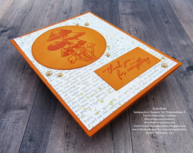 Measurements:

Pumpkin Pie Cardstock
Card Base - 8 1/2" x 5 1/2" (Scored at 4 1/4")
Large Circle die cut with the Stylish Shapes Dies
Sentiment Label - 2 1/4" x 1 1/8"
Nature's Sweetness Specialty Designer Series Paper
Card Front - 5 1/4" x 4"

If you have been following me for a while, you know how much I love creating clean and simple card designs using designer series paper. Recently I rediscovered Nature's Sweetness Specialty Designer Series Paper from my crafting stash and I just love the simple elegance of the beautiful gold embossing on the designs in this paper pack. For today's card, I chose the design that has a newsprint feel to it with subtle Gold embossed splatters and I applied Pumpkin Pie Classic ink softly over the card front to give it just a hint of color. This helps bring out the Gold splatters and gives the card design more of a vintage feel. The Clear embossing of the focal image and sentiment add a wonderful contrast to the card design and I love the subtle glossy look that the embossing powder adds. For a touch of bling, I added several of the Champagne Iridescent Dots that coordinate perfectly with the other elements of this card design.


If you live in the U.S. and do not have a Stampin' Up! Demonstrator, please contact me and I would be happy to help you with your creative projects. You may also visit my Online Store to place your order and have it shipped to you.

Until Next
Time
Happy
Stamping,
Tricia Butts
Independent Stampin' Up!
Demonstrator
Like What You
See? Visit My Online Store Here
Visit My Facebook Business Page for Updates & Ideas
Click here to Contact Me
No comments:
Post a Comment