
Welcome to the Around The World On Wednesday April Blog Hop and this month we are having some fun with a This or That challenge. We have been challenged to create two projects that share some similarities but are different, to see which you prefer - This or That. Our talented Design Team is excited to share their projects to see which one you prefer.

For my two cards, I chose the same layout using the Notes of Nature stamp set, Perennial Postage Dies and Stylish Shapes Dies. Both are clean and simple card designs but one is black and white while the other is a pink monochromatic design. This challenge was so much fun and I loved playing with the different designer series paper and making little changes that helped make one card different from the other. I hope you like them.

Products Used:
This Card
Zoo Crew Designer Series Paper (item #161304) - Retiring
Notes of Nature stamp set (item #162630) - Retiring
Perennial Postage Dies (item #163607)
Stylish Shapes Dies (item #159183)
Timeworn Type 3D Embossing Folder (item #156505)
Thick Basic White Cardstock (item #159229)
Basic White Cardstock (item #159276)
Basic Black Cardstock (item #121045)
Memento Tuxedo Black Pad (item #132708)
Festive Pearls (item #159963) - Retiring
Stampin' Dimensionals
That Card
Bright & Beautiful 6" x 6" Designer Series Paper (item #151449)
- Retiring
Notes of Nature stamp set (item #162630) - Retiring
Perennial Postage Dies (item #163607)
Stylish Shapes Dies (item #159183)
Berry Burst Cardstock (item #144243)
Versamark Pad (item #102283)
Metallics Embossing Powders (item #155555) - Retiring
Sheer Ribbon Combo Pack (item #161635) - Retiring
Pastel Adhesive Backed Sequins (item #160387) - Retiring
Stampin' Dimensionals

Measurements:
This Card
Thick Basic White Cardstock
Card Base - 8 1/2" x 5 1/2" (Scored at 4 1/4")
Basic Black Cardstock
Card Front - 5 1/4" x 4" Embossed with the Timeworn Type 3D Embossing Folder
Basic White Cardstock
Sentiment Label die cut with the Stylish Shapes Dies
Zoo Crew Designer Series Paper
3 Medium Rectangles die cut with the Perennial Postage Dies

That Card
Berry Burst Cardstock
Card Base - 5 1/2" x 8 1/2" (Scored at 4 1/4")
Sentiment Label die cut with the Stylish Shapes Dies
Bright & Beautiful Designer Series Paper
Card Front - 5 1/4" x 4"
3 Medium Rectangles die cut with the Perennial Postage Dies

Both of these cards are basically the same layout using different designer series papers to create unique designs. For the "This" card, I chose to emboss the Basic Black cardstock card front with the Timeworn Type 3D Embossing Folder to add some wonderful texture. I chose black and white patterns from the Zoo Crew Designer Series Paper pack to create the focal rectangles and stamped the sentiment from the Notes of Nature stamp set using Memento Tuxedo Black ink. For embellishments, I used the Silver Pearls from the Festive Pearls, to add a touch of bling. 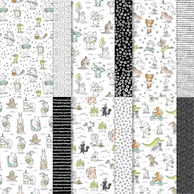

For the "That" Card, I chose patterns from the Bright & Beautiful 6"x6" Designer Series Paper pack to create an ombre look to the design. I chose one of the Bubble Bath ombre designs for the card front and then three different shades ranging from Bubble Bath to Berry Burst for the three rectangles. For this card, I chose to heat emboss the sentiment with Gold embossing powder onto the Berry Burst sentiment label to make it pop and I added Gold Sequins for a touch of bling. I also added a piece of Bubble Bath Sheer Ribbon underneath the sentiment label to help step up the design.
So, I am curious. Which do you prefer? The Black & White This card or the Pink Monochromatic That Card? Let me know in the comments.

Thank you for taking the time to visit my blog. I hope that my card designs will help inspire you to create your own projects that share common elements or products to help you come up with your own unique ideas. There are so many wonderful options to explore. Don't forget to check out the Last Chance Product Sale and save up to 60% off select retiring products from the 2023-2024 Annual Catalog and January-April 2024 Mini Catalog. All retiring products are available while supplies last or until April 30th. Make sure to place your order soon to avoid missing out on your favorite retiring products.


Roll Call List

If you live in the U.S. and do not have a Stampin' Up! Demonstrator, please contact me and I would be happy to help you with your creative projects. You may also visit my Online Store to place your order and have it shipped to you.

Until Next
Time
Happy
Stamping,
Tricia Butts
Independent Stampin' Up!
Demonstrator
Like What You
See? Visit My Online Store Here
Visit My Facebook Business Page for Updates & Ideas
Click here to Contact Me
Save Up To 60%
During the Last Chance Products Sale
Click Below To Shop Now

Explore Your Creativity
With The New Online Exclusives Products
Click Below To Visit My Online Store

Oh Tricia, now this is a really tough choice. Both are such striking cards ... but I think I will choose the pinks. I like how the postage stamp dies show up so well on this one, and the touches of gold are really lovely. xxxx
ReplyDeleteGreat use of Designer Series Paper! I am always drawn to anything black and white, but the pinks are equally as awesome!
ReplyDeleteI just love that a card gives a different vibe when you just use other DSP. Thank you
ReplyDeleteBoth cards are so pretty. I think I'll choose the black & white. It just pops out at me!
ReplyDeleteIsn't it interesting how using the same layout with different colours really changes up the feel of a card? For me, my favourite is the black and white because it's such a classic, striking combination.
ReplyDeleteBoth pretty cards! I love the pinks and the way the gold embossing make it look a bit more fancy.
ReplyDelete