Welcome to the Stamping Inkspirations June Blog Hop as we showcase projects with the theme "Splish Splash". You will have the opportunity to visit with talented crafters as they share their projects and ideas to help inspire you to create your own wonderful creations.
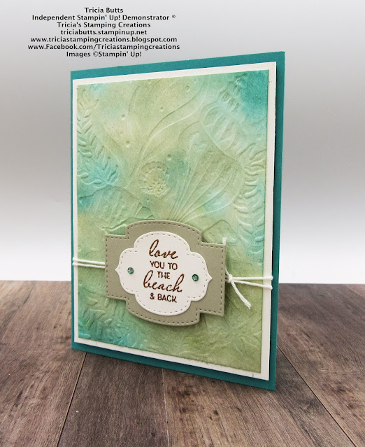
When I think of Splish Splash, it reminds me of days at the beach, playing in the waves and searching for seashells. So I just had to use the beautiful Friends Are Like Seashells stamp set and the coordinating Seashells 3D Embossing Folder to create my card design. To create the background, I sponged Sahara Sand, Coastal Cabana and Bermuda Bay Classic ink onto a piece of Basic White cardstock to create the feel of the ocean. The embossing is actually debossed so that the design sinks down into the card rather than be raised.
Friends Are Like Seashells stamp set (item #154368)
Seashells 3D Embossing Folder (item #154309)
Stitched So Sweetly Dies (item #151690)
Bermuda Bay Cardstock (item #115317)
Sahara Sand Cardstock (item #121043)
Basic White Cardstock (item #159276)
Coastal Cabana Classic Ink Pad (item #147097)
Bermuda Bay Classic Ink Pad (item #147096)
Sahara Sand Classic Ink Pad (item #147117)
Versamark Pad (item #102283)
Bermuda Bay Stampin' Blends Combo Pack (item #154878)
Metallics Embossing Powder (Copper, Gold, Silver - item #155555)
Baker's Twine Essentials Pack (item #155475)
Basic Rhinestone Jewels (item #144220)
Bermuda Bay Cardstock
Card Base - 8 1/2" x 51/2" (scored at 4 1.4")
Basic White Cardstock
Layer 1 - 5 1/4" x 4"
Layer 2 - 5" x 3 3/4" sponged with Bermuda Bay, Coastal Cabana and Sahara Sand Classic inks
Sentiment Label heat embossed with Copper embossing powder
Sahara Sand Cardstock
Label die cut with Stitched So Sweetly Dies
This card is easy to create and the embossing adds wonderful texture to the background of this design. I love the way these colors work together to create the look and feel of the ocean and the Sahara Sand label adds a nice contrast to the design. I colored the Basic Rhinestones with Dark Bermuda Bay Stampin' Blends to coordinate with the card and added them to the sentiment label.
Thank you for taking the time to visit my blog. I hope that my card design helps inspire you to explore creating your own wonderful projects using this theme. Embossing folders are a great way to add texture to your designs without a lot of extra work.
Now it's time to visit Shel's wonderful blog and see what she has to share with us. Just click the Next button below to visit her blog or use the Roll Call List to find your way. We would appreciate it if you would leave us a comment and let us know what you liked about our projects. I hope you enjoy the rest of our blog hop. Roll Call List
Angie McKenzie ● Leonie Stuart ● Libby Fens ● Karen Henderson
Annette Ball ● Tricia Butts ● Shel Anderson
Elaine de Montmorency ● Mo Rootes ● Deb Macdowell
Alejandra Gomez ● Satomi Wellard ● Ann Krucek ● Teri West
Danielle Kassing ● Gez Carpenter ● Aurélie Fabre
Rebecca-Jo Unwin ● Jill Chapman ● Susan Simpson
Terry Hamilton ● JoAnn Pollock ● Rochelle Laird-SmithIf you live in the U.S. and do not have a Stampin' Up! Demonstrator, please contact me and I would be happy to help you with your creative projects. You may also visit my Online store to place your order and have it shipped to you.
Until Next
Time
Happy
Stamping,
Tricia Butts
Independent Stampin' Up!
Demonstrator
Like What You
See? Visit My Online Store Here
Visit My Facebook Business Page for Updates & Ideas
Click here to Contact Me
Stock Up On Your Favorite Retiring Products
From The January-June 2021 Mini Catalog
Click Below To Visit My Online Store
Explore Your Creativity
With The Kits Collection


Beautiful watercoloured background for your gorgeous card!
ReplyDeleteLovely card Tricia, the inked background is so effective x
ReplyDeleteSuch a beautiful effect you achieved with your sponging and deimbossed treatment!! Wonderful card!!
ReplyDeleteLovely card
ReplyDeleteThe colours you've chosen give a really watery effect, and I love the debossed side of the embossing folder. It has a totally different look to the raised images.
ReplyDeleteBeautiful watercolored background !
ReplyDeleteLove that you chose the de-bossed side....beautiful.
ReplyDeleteBeautiful background colours! What a great idea to use the de-bossed side
ReplyDeletebeautiful background - great colours.
ReplyDeleteWhat a gorgeous background!
ReplyDeleteAwesome colors that you sponged that amazing background with, Tricia! Love the doubling up on the labels that you did for the sentiment. Thanks for the inspiration and for hopping with us. x
ReplyDelete